What Is an EMA Cloud? Reading Moving Average Ribbons in NinjaTrader 8
An EMA cloud and a moving average ribbon are the same idea — the space between moving averages, made visible. Here is what that space tells you, how to read a pullback and a chop from it, what NinjaTrader’s own ribbon gives you out of the box, and where it stops.
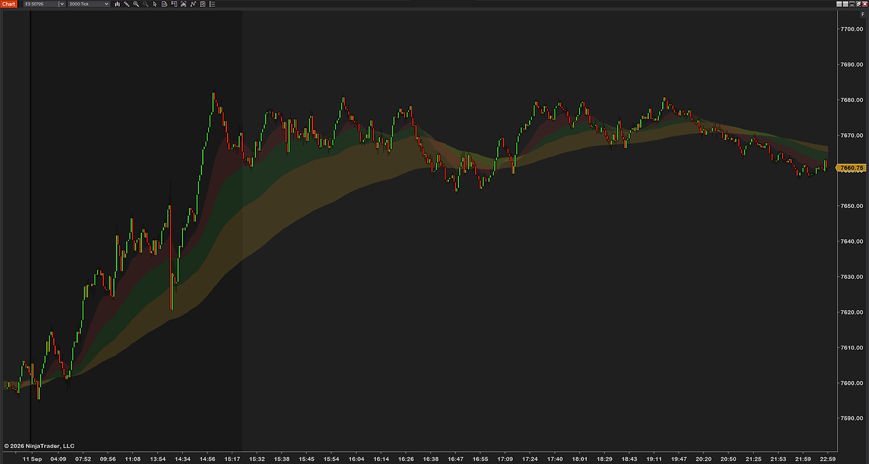
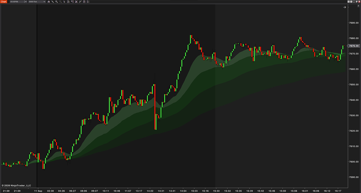
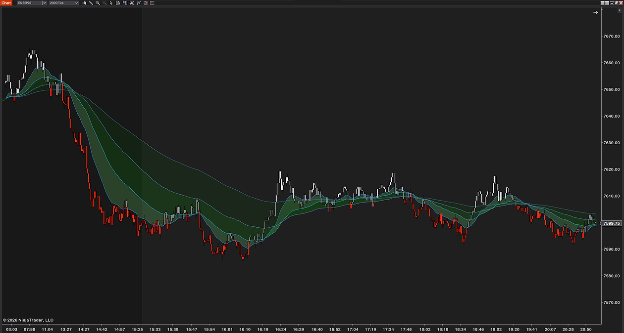
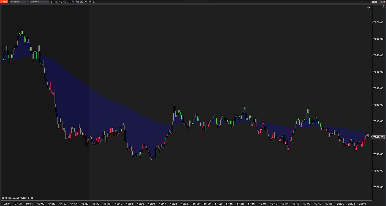
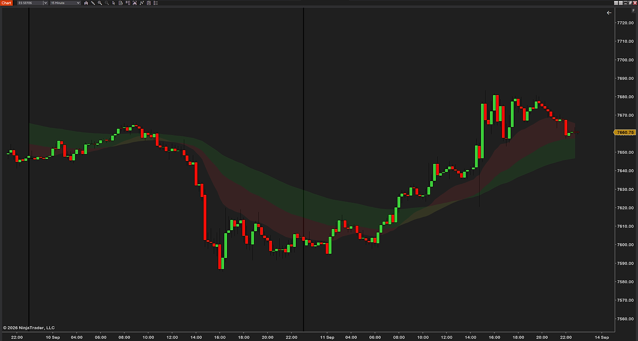
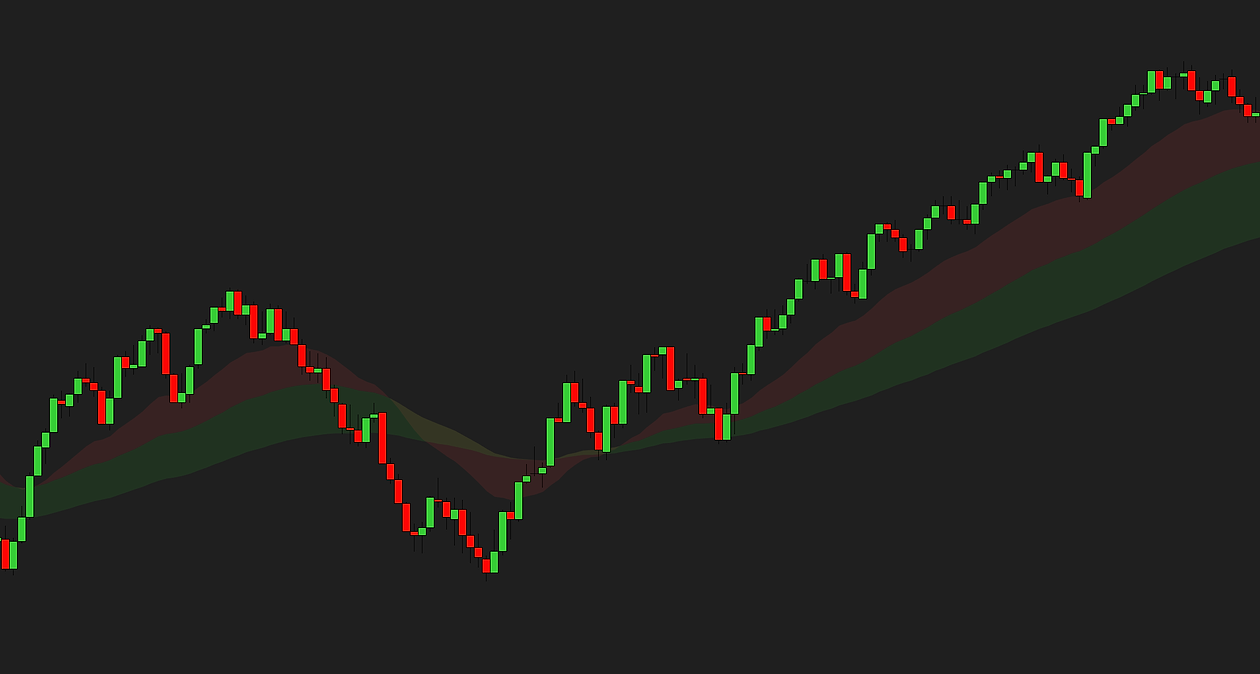
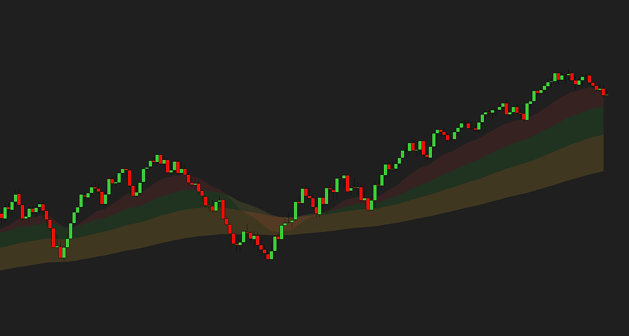
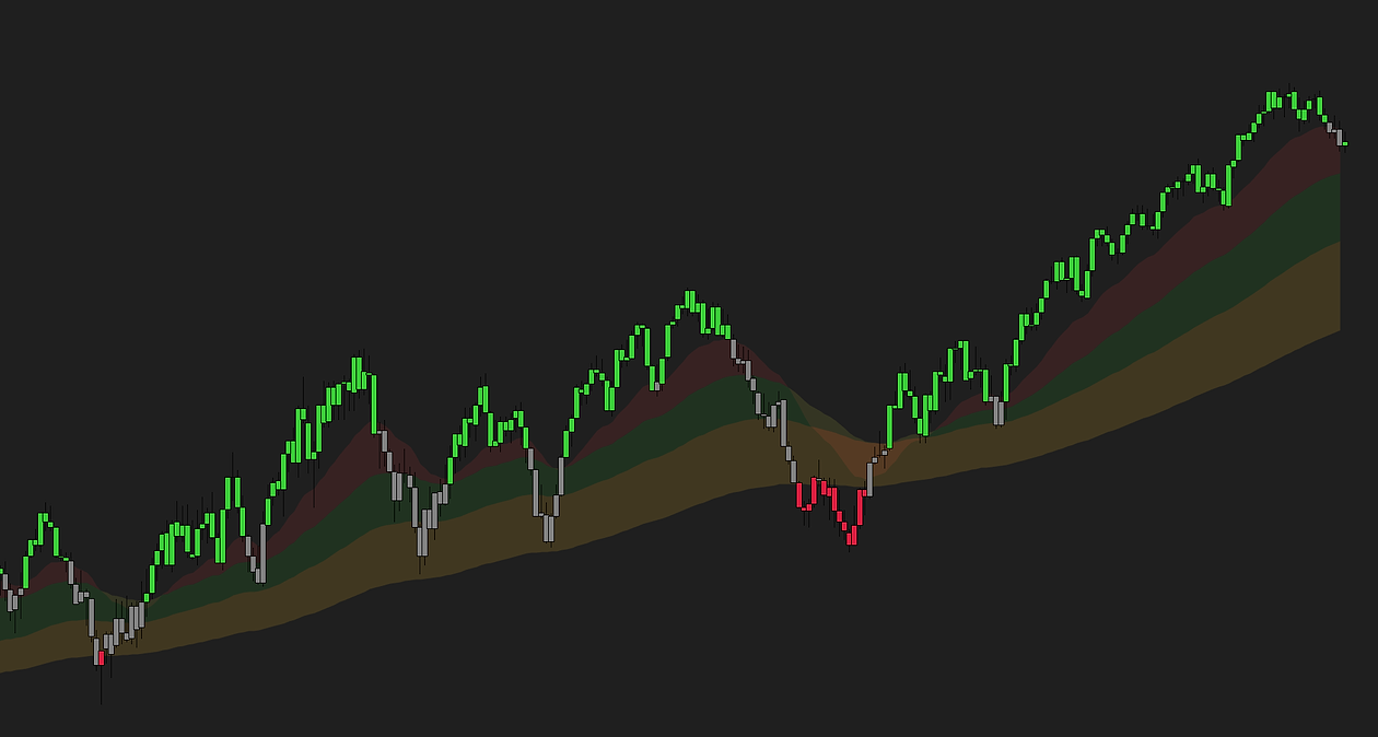
What an EMA cloud is
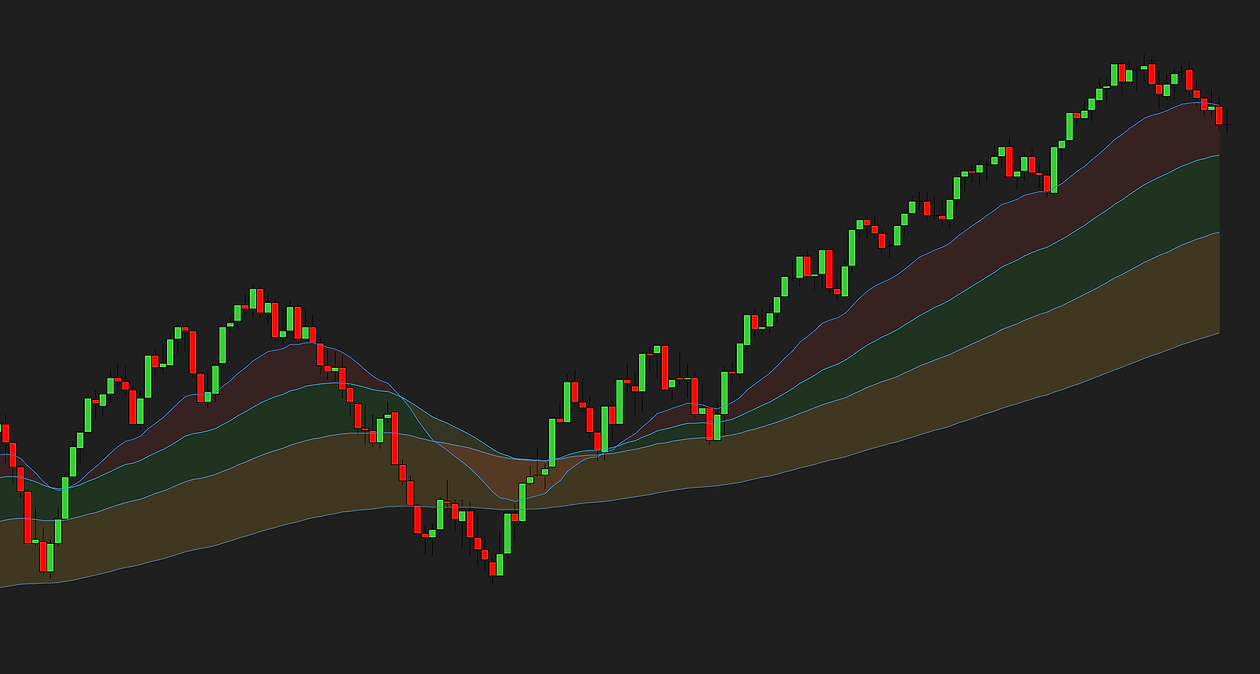
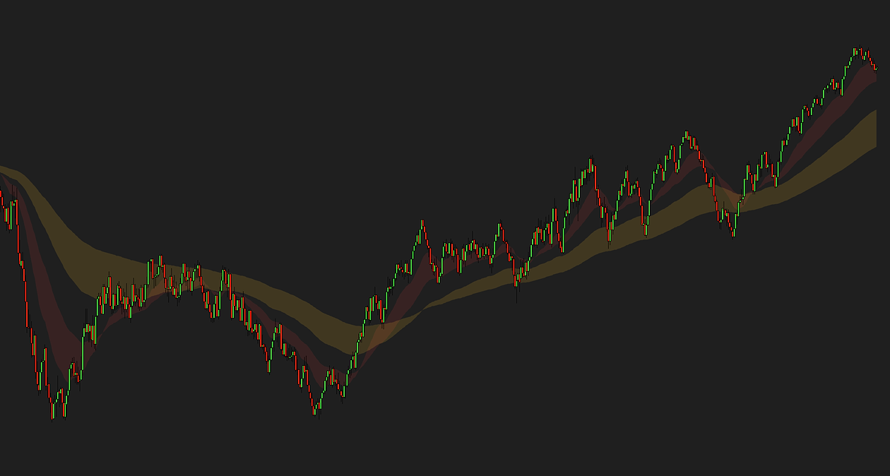
Take two moving averages of different lengths — say a 9 and a 21 — and instead of reading them as two lines, read the gap between them. When the fast one is above the slow one the gap is bullish; below, bearish. Shade that gap and you have a cloud. Stack several averages and shade each gap and you have a ribbon. The words get used interchangeably, and the idea is identical: make the relationship between the averages visible as a shape rather than a tangle of lines you have to decode.
“EMA cloud” usually means exponential averages, because they react faster; “ribbon” usually means a stack of several. Neither word is a standard, and the trader who says one means the same thing as the trader who says the other.
How to read it
- Width is momentum. The averages separating means price is moving faster than the slower average can follow. A widening band in one direction is a trend with momentum behind it.
- Tilt is direction. The band points the way the averages are heading. Flat means the averages agree that nothing is happening.
- Pinching is a warning. The averages converging means the move is slowing. A pinch often comes just before a reversal or a breakout, and the band does not tell you which — only that the current move is running out of the thing that made it.
- The edge is a reference. In a trend, pullbacks tend to reach the near edge of the band and turn. A close through the far edge is the first sign the trend has changed hands.
- Colour flips are late by design. The averages cross after price has already moved. That is not a flaw — it is what filters the noise — but it means the cloud confirms a trend rather than predicting one.
What NinjaTrader 8 has built in
NinjaTrader ships a Moving average ribbon indicator, and its own description is accurate: it “plots multiple moving averages of increasing lengths on the same panel to visualize trend structure”. It draws eight averages, and it has exactly three settings:
| Setting | Default | What it does |
|---|---|---|
| Moving average | Exponential | The type used for all eight lines: Exponential, Hull, Simple or Weighted |
| Base period | 10 | The length of the fastest average |
| Incremental period | 10 | How much longer each successive average is, so the defaults give you 10, 20, 30 and so on up to 80 |
What it does not do is fill anything. The eight lines are drawn as lines, in a fixed run of colours from yellow to red, and the space between them stays empty. You also cannot pick the individual periods — the eight are always evenly spaced from the base — so a 9/21 pair or a 20/50/200 stack is not something it can draw.
For completeness: the one filled cloud NinjaTrader does ship is the Ichimoku Cloud, whose shaded area is the gap between its two leading spans, shifted forward in time. It is a different tool built on a different idea, and it is not an EMA cloud.
How to add the built-in ribbon
- Right-click the chart and choose Indicators…
- Find Moving average ribbon in the list on the left and double-click it.
- Under Parameters set Moving average to Exponential, then Base period and Incremental period. A base of 5 and an increment of 5 gives a tight 5-to-40 ribbon for a fast chart; the 10/10 default is a broader 10-to-80.
- Click OK. You now have eight lines, and the shape between them is the ribbon.
If that is all you wanted, stop here — it is free and already installed. The rest of this page is about reading the shape, and about what the lines-only version leaves out.
EMA or SMA for a cloud?
An exponential average weights recent bars more, so it turns sooner and hugs price closer; a simple average treats every bar in its window the same, so it is smoother and slower. For a cloud that difference matters more than usual, because the cloud is read by its shape: EMAs pinch and flare quickly, which is what you want on an intraday chart where a trend can start and end inside an hour. SMAs make a calmer cloud that suits a swing chart, where you would rather not see every wobble.
There is no correct answer, only a chart type. The people who tell you EMA is “better” are usually scalping; the people who prefer SMA are usually holding overnight. Pick the one that matches how long you are in a trade.
Which periods to use
The pairs that come up again and again are conventions, not discoveries — they work partly because enough people watch them:
- 9 and 21 (or 8 and 21) — the common intraday pair. Fast enough to catch a move on a 1- to 5-minute chart, slow enough not to flip on every bar.
- 20 and 50 — the swing pair. The 50 is widely watched on its own, so the band between them tends to act as support and resistance for pullbacks.
- 50 and 200 — the long-term pair everyone quotes. On an intraday chart it is mostly context: which side of it you are on says more than the band itself.
Two rules of thumb. Keep the ratio between the averages roughly two-to-one or wider; a 20 and a 25 sit on top of each other and the cloud never opens. And use the same periods every day for long enough to learn what the shape means on your chart — the value is in recognition, and recognition needs repetition.
Pullbacks, chop and the edge of the zone
The single most useful thing a cloud does is give a pullback somewhere to stop. In an uptrend, price runs ahead of the band, comes back, and the near edge of the band is where buyers tend to show up again. The trade is not “buy at the edge” — it is look at the edge, and see whether price does what it has been doing.
The second most useful thing is telling you when not to trade. When the band pinches flat and price crosses through it several times in a row, the averages have no opinion and neither should you. That is chop, and a cloud makes it obvious in a way two crossing lines never quite do.
A close through the far edge is the third signal: the trend that was carrying the band has stopped. It is late, as everything built on averages is late, but it is also rarely wrong about the thing it is late to.
What a colour-filled version adds
A colour-zone indicator takes averages you define and fills the space between each pair. The points that separate a good one from the built-in ribbon:
- Your own periods. Four averages, each with its own length, so 9/21/50/200 is one indicator rather than four plus your imagination.
- Your own type and price input. Our free EMA cloud indicator for NinjaTrader 8 offers eight MA types — EMA, SMA, WMA, HMA, DEMA, TEMA, VWMA and TMA — on close, HL2, HLC3 or OHLC4.
- A colour and an opacity per zone. Three zones between four averages, each controlled separately, so the fast zone can be loud and the slow zone can be a faint background.
- Paint bars. The candles themselves coloured bullish above every average, bearish below every average, neutral inside the zones — so the trend reads even when the zones are hidden behind price.
- Cross alerts. A sound when price crosses any of the four averages, with a cooldown so a chopping market does not ring the bell every bar.
The built-in ribbon shows you the structure. A filled version shows you the same structure and lets you read it from across the room.
How to install it
- Download the free EMA cloud indicator — keep the .zip zipped.
- Open the Control Center → Tools → Import → NinjaScript Add-On… and select the .zip. NinjaTrader documents the process in its import guide, and we walk through every step, error message and the update rule on our installation page.
- On a chart, right-click → Indicators…, add it, and set the four periods to the ones you actually watch.
- Turn the zones down to a low opacity first. It is easier to raise a faint cloud than to see price through a loud one.
Three mistakes worth avoiding
- Trading the colour flip. The cloud turns after the move. Entering on the flip buys the top of the leg that caused it more often than not. Use the flip to set the direction; use the pullback to time the entry.
- Stacking too many averages. Eight lines feel thorough and read as noise. Two or three zones tell you everything a ribbon can; the rest is decoration.
- Changing periods to fit last week. Any pair can be tuned to have called the last three days. Pick a pair, keep it, and learn its shape on your instrument — that is where the value is.
Common questions
What is an EMA cloud?
The space between two or more exponential moving averages, read as a band rather than as separate lines. When the fast average is above the slow one the band is bullish; below, bearish. Its width shows momentum, its tilt shows direction, and a pinch means the move is slowing.
Is an EMA cloud the same as a moving average ribbon?
Yes, in practice. Cloud usually means two exponential averages with the gap shaded; ribbon usually means a stack of several averages. Both describe the relationship between moving averages as a shape instead of a set of lines, and traders use the words interchangeably.
Does NinjaTrader 8 have a moving average ribbon built in?
Yes. The Moving average ribbon indicator draws eight averages of increasing length. Its settings are the moving average type, a base period and an incremental period, so the defaults of 10 and 10 give averages of 10, 20, 30 and up to 80. It draws lines only and does not fill the space between them.
Can the built-in ribbon fill the space between averages with colour?
No. It plots eight lines in a fixed run of colours and leaves the gaps empty, and it cannot use individual periods such as 9 and 21. The only filled cloud NinjaTrader ships is the Ichimoku Cloud, which is a different tool built on a different idea.
Which EMAs should I use for a cloud?
The common intraday pair is 9 and 21, the swing pair is 20 and 50, and 50 and 200 is the long-term reference. Keep the ratio between the two roughly two-to-one or wider so the cloud actually opens, and use the same pair every day long enough to learn what its shape means on your chart.
Should a cloud use EMAs or SMAs?
Exponential averages turn sooner and make a cloud that pinches and flares quickly, which suits intraday charts. Simple averages are smoother and slower, which suits swing charts. Match the type to how long you hold a trade rather than to what someone else calls better.
Does an EMA cloud repaint?
No. A moving average on a closed bar is fixed and does not change later. The only bar that moves is the one still forming, because its close is still moving, and that is the bar not being finished rather than history being rewritten.
Related guides
- SuperTrend settings and the repaint question — a different way of reading trend direction from one line.
- How to show multiple timeframes on one chart — the cloud on your chart, and whether the one above agrees.
- How to use VWAP in NinjaTrader 8 — the other average most intraday traders keep on the chart.
The honest part
A cloud will not pick your trades — no indicator will. What it does is make the trend hard to misread, so you spend less effort deciding which way the market is leaning and more on the decision that matters. Read the zones as context, not signals; the entries and the stops are still yours. And if eight plain lines from the built-in ribbon already tell you what you need, use them and keep your chart simple.